If you’re trying to format income statement output for a mid-market UK business, the problem usually isn’t the spreadsheet. It’s the story the numbers tell.
A finance team can produce a technically correct profit and loss account and still leave leadership unclear on a basic question: are we making money from core operations, or are one-off projects, grants, implementation costs, and overhead allocations masking what is really happening? That issue gets sharper in businesses running on Microsoft 365, Dynamics 365, Power BI, and Dataverse, where HR, operations, and finance data often sit close enough to connect, but still not close enough to explain each other cleanly.
A well-formatted income statement fixes that. It supports compliance under UK rules, and it gives HR directors, CIOs, and operational leaders a view they can use when judging hiring costs, platform investments, software implementation spend, and service delivery performance.
The Core Components of a UK Income Statement
In UK practice, the income statement is still widely referred to as the Profit and Loss Account, but the formatting discipline matters more than the label. For listed companies, the move to IFRS became mandatory from 1 January 2005, replacing earlier UK GAAP presentation approaches and pushing reporting towards a clearer multi-step structure with line items such as turnover, cost of sales, gross profit, administrative expenses, distribution costs, finance costs, and profit before tax. According to the UK FRC annual review of corporate reporting 2022 to 2023, 92% of FTSE 350 companies now use the function of expense format.
What belongs at the top
Start with turnover. In a service business, that means income from the work you deliver. If you’re implementing Dynamics 365, managing support contracts, or running HR transformation projects, turnover should capture those core earned revenues for the reporting period.
Below that comes cost of sales. Many teams manage this area untidily. Direct delivery labour, implementation resources, subcontractor costs, and directly attributable software or delivery licences often belong here if they are tied to fulfilment.
Then you arrive at gross profit. This subtotal matters because it shows whether your service model works before overhead starts to cloud the picture.
Where classification usually goes wrong
The next layer is operating expenses. In a UK format income statement, the distinction between distribution costs and administrative expenses isn’t cosmetic.
| Line item | What it usually includes |
|---|---|
| Distribution costs | Selling and fulfilment-related costs connected to getting the service to market or customer |
| Administrative expenses | Central overhead such as leadership salaries, finance, HR, office systems, and general support functions |
| Finance costs | Interest and related financing charges |
| Other operating income | Grants or similar items that should be visible without distorting core trading |
If a business buries everything in administration, gross and operating performance become far less useful.
Practical rule: If leadership can't tell whether delivery is profitable before central overhead, the format is too blunt.
Why this matters beyond finance
A good income statement helps non-finance stakeholders read the business properly. HR leaders looking at recruitment platform costs, employee onboarding spend, or people-related overhead need visibility into what sits in direct delivery versus support. If you want a useful primer on deciphering business financial reports, that guide is a sensible companion for managers who don't live in the ledger every day.
For workforce-heavy businesses, the format also becomes more useful when paired with operational tools. An employee cost calculator can help pressure-test whether people costs are being interpreted as direct service delivery, overhead, or a blend of both.
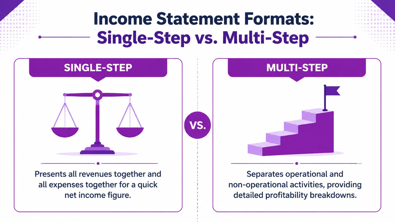
Choosing Your Format Single-Step vs Multi-Step
A single-step income statement is easy to produce. It puts all income together, all expenses together, and lands on net profit quickly. That's fine for a rough internal snapshot, but it doesn't help much when you need to explain performance to a board, investor, lender, or department head.
A multi-step format income statement does more work. It separates core trading from overhead and non-operating items, so the reader sees where profit is created and where it is consumed.
The real difference in practice
Here is the simplest comparison.
| Format | Strength | Limitation |
|---|---|---|
| Single-step | Fast to prepare and easy to read at a glance | Hides gross profit and operating profit |
| Multi-step | Shows trading performance in layers | Takes more discipline in coding and review |
That extra discipline is worth it. The 2015 introduction of FRS 102 simplified reporting for non-IFRS entities and supports a structure that naturally fits a multi-step presentation. The ICAEW guidance on FRS 102 notes investor preference clearly, with 94% of UK investors preferring this format for trend analysis.
Why mid-market firms should usually avoid single-step
Single-step works against management insight because it compresses everything into one answer. If your business has implementation projects, recurring support income, internal product development, software subscriptions, and one-off transformation spend, single-step reporting masks the economics.
That becomes a serious issue in service-led Microsoft ecosystem businesses. You need to know:
- Whether delivery is profitable before central overhead
- Whether administrative spend is rising because of growth or inefficiency
- Whether one-off project costs are distorting what would otherwise be a stable operating result
A useful outside explanation of the multi-step format for service firms can help if you're comparing presentation styles, but in UK mid-market practice the multi-step route is usually the better management document.
The best format isn't the shortest one. It's the one that makes bad news visible early.
What works and what doesn't
What works is a structure with clear subtotals that leadership can follow without a finance glossary. What doesn't work is an over-simplified statement that saves ten minutes in preparation but creates hours of confusion in review.
If your income statement needs a long verbal explanation every month, the format is doing too little.
A Practical Guide to Building a Multi-Step Statement
The mechanics of formatting aren't difficult. The challenge is deciding what belongs where, then keeping that logic consistent every month.
Start with turnover that matches reality
Pull turnover from the period you are reporting, and make sure the income belongs to that period under your accounting policy. For a service business, this often means separating implementation revenue, recurring support, managed services, and any other service lines internally, even if they roll up into one external turnover line.
Don't begin with formatting. Begin with a clean revenue map.
A practical internal working sheet often helps before the statutory presentation is built. I prefer to reconcile each revenue stream to the ledger first, then collapse it into the published format once the detail is proven.
Build gross profit carefully
The next stage is cost of sales. Put direct delivery labour, directly attributable contractor fees, and other service-fulfilment costs here where appropriate. Leave central support functions out.
Many statements go off course at this stage. ICAEW reports a 78% compliance success rate in multi-step formats for 2023 filings, but misclassification remains a common issue that can lead to average HMRC penalties of around £45,000, according to the HMRC annual report and accounts 2022 to 2023.
A simple working model looks like this:
| Stage | Focus |
|---|---|
| Turnover | Income earned from core services during the period |
| Less cost of sales | Direct fulfilment costs only |
| Equals gross profit | Core delivery profitability before overhead |
| Less operating expenses | Admin and other operating overheads |
| Equals operating profit | Trading result before financing and tax |
Controller's view: If your gross profit line moves dramatically after year-end adjustments, your coding discipline during the year isn't strong enough.
Separate operating expenses with purpose
After gross profit, split overheads into sensible operating categories. Administrative expenses often include finance, HR, leadership, software overhead, internal IT, and office running costs. If your chart of accounts is too flat, this is the point where the statement starts losing value.
One reliable way to improve the format income statement is to create management mappings that sit above nominal codes. That lets you preserve bookkeeping detail while presenting a cleaner decision-making view.
The walkthrough below is worth watching if you want a visual refresher on how the pieces fit together in practice.
Keep non-operating items below the trading result
Interest, financing costs, and similar items should sit below operating profit. If you have grants or similar items, make them visible rather than allowing them to blur operational performance.
This is also where judgement matters. Some teams force unusual items into normal overhead and then wonder why trend analysis becomes unreliable. If an item is material and genuinely unusual, clarity usually beats compression.
Finish with tax and net profit
Once non-operating items are included, you move to profit before tax, tax, and then net profit. The arithmetic is straightforward. The presentation quality is where the value sits.
A strong multi-step statement should let a board member answer three questions in under a minute:
- Did core services make money?
- Did overhead absorb too much of that margin?
- Did unusual items change the bottom line materially?
If the statement can't answer those questions, rebuild the format before the next reporting cycle.
Advanced Formatting for Deeper Stakeholder Insight
A board meeting gets difficult when turnover is on plan, net profit is acceptable, and nobody can explain why overhead has shifted. The format is usually the problem. A compliant income statement can still be poor management reporting if it hides the operational drivers behind broad headings.

Present the same statement in more than one view
For a mid-market UK business, one P&L format rarely answers every stakeholder question. Finance needs control and consistency. Department heads need context. The board needs a quick read on whether margin pressure is coming from delivery, headcount, systems, or one-off change activity.
That is why I recommend keeping the main income statement intact and adding management views beside it. The statutory or primary reporting format stays disciplined. The supporting views make it easier to interpret.
| Management view | Why it helps |
|---|---|
| Common-size P&L | Shows cost movements as a percentage of turnover |
| Departmental split | Identifies which functions are increasing or containing spend |
| Project or service line view | Separates recurring activity from implementation or change work |
| Monthly trend view | Shows whether a movement is isolated, seasonal, or persistent |
A common-size view is particularly useful when the business is investing in technology or people. Software subscriptions, implementation support, recruitment costs, and training can all rise at once. Looking only at absolute values makes that mix harder to judge. Looking at each line relative to turnover shows whether the cost base is changing in a controlled way or drifting.
Connect the numbers to people and technology decisions
Proper formatting at this stage begins to influence decisions, not just presentation. If administrative expenses rise, directors need to know whether the increase comes from additional HR capacity, higher recruitment activity, payroll complexity, compliance work, or a Dynamics 365 rollout that is still bedding in.
For businesses using Dynamics 365 and Power BI, that link should be built into the reporting model. A well-formatted statement lets finance trace a movement in overhead to the operational cause behind it. That matters when the board is testing the return on HR technology. If absence administration falls, onboarding becomes faster, or manual payroll adjustments reduce, the income statement should make those effects visible through cleaner category design and better supporting analysis.
The same principle applies to expenses. If cost capture is inconsistent, reporting quality drops with it. Teams reviewing expense management software in the UK are usually trying to solve an operational problem first, but the finance benefit is just as important. Better coding at source produces a cleaner P&L and fewer debates at month end.
A useful board pack lets a reader move from an overhead movement to the business reason behind it, whether that is hiring, compliance effort, system change, or service delivery pressure.
Build dashboards without weakening accounting control
Power BI can improve interpretation, but only if the underlying structure is stable. Start with clean mappings between nominal codes, departments, cost centres, and reporting categories. Then test whether the same transaction lands in the same place every month unless there is a genuine reason to change it.
After that, dashboard filters become especially useful:
- Business unit to compare trading models or service lines
- Function to separate HR, IT, finance, operations, and commercial overhead
- Period for monthly, quarterly, and year-to-date review
- Project or change flags to isolate implementation and transformation spend
The trade-off is straightforward. More dimensions give better insight, but they also increase the risk of inconsistent coding if governance is weak. I usually prefer a slightly simpler reporting model that closes accurately every month over an ambitious dashboard that nobody trusts by quarter end.
Make the format readable for non-finance audiences
Senior managers do not need every nominal code. They need clear labels, consistent subtotals, and enough explanation to interpret movement correctly. If a line says "administrative expenses" and covers HR systems, recruitment, software licences, temporary staff, and legal support, the heading is technically acceptable but commercially weak.
Good formatting makes the economics visible. Use plain-English category names. Keep subtotals consistent from month to month. Add short notes where a category includes a material mix of recurring and non-recurring cost. That approach helps operational leaders engage with the statement and gives finance a stronger base for discussing margin, headcount, and technology ROI.
Common Income Statement Mistakes and How to Avoid Them
Most income statement problems don't come from arithmetic. They come from judgement failures that become formatting failures.
The most common one in growing UK businesses is poor treatment of one-off transformation spend. A Dynamics 365 implementation, a major HR systems rollout, or a substantial data remediation exercise can be large enough to distort the operating picture if it's buried in routine overhead.
One-off digital transformation spend
UK practice often diverges from how teams expect to present costs. According to BDO's technology industry trends analysis, UK practice guided by the FRC often favours presenting material one-off digital transformation costs separately above operating income, and the analysis states that this approach led to 30% better investor perception.
That doesn't mean every software invoice deserves special treatment. It means material, unusual transformation costs should not be allowed to contaminate trend reporting.
Errors that damage the format
The mistakes I see most often are these:
- Routine and exceptional costs mixed together. This makes periods incomparable and weakens management commentary.
- Capital and revenue items blurred. Teams expense everything for convenience or capitalise too aggressively to flatter the result.
- R&D-related items hidden in general overhead. That makes tax relief discussions harder and weakens visibility over technology investment.
- No audit trail behind reclassifications. A late finance pack adjustment without documentation creates confusion at year-end.
If you need to explain every month that "this line is high, but ignore it because it's unusual", the format is already failing.
A better treatment
The better approach is to agree a presentation policy before the month closes. Decide what counts as normal operating expenditure, what qualifies as a separately shown material one-off cost, and which items may need capitalisation under the relevant accounting framework.
Then stick to that policy.
A useful review process includes:
- Finance ownership of the classification decision
- Operational confirmation from the project or systems lead
- Supporting papers for anything moved out of normal overhead
- Consistent labels from month to month so trends remain readable
Small misclassifications become big management errors
A monthly pack can survive a minor coding error. A strategic decision often cannot. If HR technology costs are posted inconsistently, leaders may conclude a platform is uneconomic when the actual problem is presentation. If implementation costs are spread across normal admin lines, a business may believe overhead has structurally increased when it has not.
The point of a format income statement is not neatness for its own sake. It's decision quality.
Transform Your Financial Reporting from a Task to a Tool
Month-end is finished, the board pack is out, and the leadership team still cannot see whether rising overhead reflects poor cost control or a deliberate investment in better people processes. At that point, the issue is not bookkeeping. It is presentation.
A well-formatted income statement gives management a usable view of the business. For a UK mid-market company, that means showing where margin is under pressure, where payroll cost is shifting, and whether spending on systems such as Dynamics 365 is improving control or adding noise to overhead lines.
The strategic value comes from joining finance, HR, and operations around the same structure. If payroll journals, HR data, and nominal coding are disconnected, leaders end up debating the numbers instead of acting on them. If they are aligned, the income statement starts to answer better questions. Are recruitment costs falling after process automation? Is absence affecting service delivery margins? Are HR platform costs being offset by lower admin effort or cleaner payroll processing?
External support can help if the finance team is stretched or a specialist review is needed. A directory of Hire CPAs can be a useful starting point when assessing external resourcing options. In practice, the stronger long-term fix is better system design. This guide to payroll and accounting integration is a useful reference if you want fewer manual handoffs between payroll, HR, and the general ledger.
The Microsoft stack earns its place through this integrated approach. Dynamics 365 holds the operational detail. Power BI turns formatted financial data into trend reporting that non-finance leaders can read quickly. Used properly, that combination helps a finance team show the return on HR technology in commercial terms, not just report another software cost line.
We are DynamicsHub.co.uk. Experience HR transformation built around your business. Hubdrive's HR Management for Microsoft Dynamics 365 is the premier hire-to-retire solution, more powerful, more flexible, and more future-ready than Microsoft Dynamics 365 HR. For UK organisations that want clearer financial reporting, better workforce visibility, and stronger decision-making across HR, IT, and finance, that joined-up foundation matters.
Ready to turn reporting into something leadership can use? Contact DynamicsHub to connect HR, payroll, operations, and finance across your Microsoft environment. Phone 01522 508096 today, or send us a message.