Payroll is due. A manager is chasing a missing clocking. HR is checking whether someone's rest break was recorded. IT is being asked why the attendance report in one system doesn't match the leave figure in another. That's the normal state in a lot of mid-market organisations.
The missed opportunity sits in the same dataset.
Many already manage time and attendance closely enough to process pay and answer disputes. Fewer use that data to ask harder questions about fairness, inclusion, and risk. Which groups are working late most often. Which teams rely on informal flexibility rather than approved flexible working patterns. Where short-term absence clusters sit beside poor line management or inconsistent rostering. Those patterns rarely appear in a headline payroll report, but they're often visible in the raw attendance record.
That's why time and attendance deserves a bigger role in HR strategy. If your Microsoft estate already includes Dynamics 365, Dataverse, Teams, Outlook, and Power BI, you've got the foundations to turn operational data into something far more useful. A good starting point is to treat attendance as both a compliance control and an insight source, then build from there using a joined-up model rather than a spreadsheet workaround. For a practical baseline on the operational side, see this guide to time and attendance in Dynamics 365.
Introduction The Untapped Potential in Your Timesheets
A timesheet usually gets viewed as evidence. Evidence for payroll, evidence for overtime approval, evidence for Working Time compliance. That's necessary, but it's too narrow.
Attendance data also shows how work is experienced across your organisation. It shows whether flexibility is available in practice or only in policy. It shows where managers depend on certain people to absorb extra hours. It shows whether absence is being treated consistently, and whether some groups are carrying a pattern of disadvantage that standard HR reporting misses.
What attendance data can reveal
Used properly, attendance records can help HR and IT leaders examine questions such as:
- Workload fairness: Are extra hours concentrated in one function, level, or employee group?
- Flexibility access: Do approved flexible arrangements align with who requests them and who uses them?
- Burnout signals: Are missed breaks, repeated late finishes, and unscheduled absence appearing together?
- Manager behaviour: Do certain teams show unusual exception patterns that point to poor planning or weak policy enforcement?
Those aren't payroll questions. They're culture questions.
Practical rule: If a D&I issue affects time, access, flexibility, leave, or manager discretion, your attendance data probably contains part of the answer.
Why this matters to HR and IT together
HR owns the policy meaning. IT owns much of the data plumbing, security model, and reporting architecture. When those teams work separately, the result is often a technically accurate dashboard that nobody trusts, or a well-meant HR metric that can't be produced reliably.
The stronger approach is to define a small set of inclusion-focused measures, capture them consistently in Dataverse, and surface them through role-based Power BI reporting. That shifts time and attendance from an administrative process into a decision system.
Beyond Compliance Strategic D&I Insights from Attendance Data
Most organisations start with compliance because they have to. In the UK, adherence to the Working Time Regulations 1998 requires employers to track and limit average weekly working hours to 48 hours over a 17-week reference period, unless an employee has signed a voluntary opt-out agreement. Automated time tracking systems are increasingly critical to provide real-time visibility and proactive alerts if staff risk breaching these legal limits, as outlined in this UK Working Time guide.
That legal requirement matters. But once you've got the data, stopping there is a mistake.
The strategic lens
Attendance data is behavioural data. It records how policies play out under pressure. A flexible working policy may look inclusive on paper, but the attendance pattern may show that one department still starts early, stays late, and implicitly rewards presenteeism. A family-friendly leave approach may be well drafted, yet return-to-work patterns might reveal uneven support between teams.
The point isn't to infer motive from raw data. The point is to identify where to ask better questions.
Useful D&I questions hidden inside attendance records
A mature attendance model can support analysis such as:
-
Who works outside standard patterns most often
This can indicate uneven workload distribution, manager dependency, or hidden expectations affecting carers, disabled staff, or junior employees.
-
Who takes breaks consistently and who does not
Missed or shortened breaks can point to operational pressure, unhealthy team norms, or local management issues.
-
Which teams have recurring unscheduled absence
That may reflect wellbeing pressure, scheduling friction, or an environment where some employees don't feel properly supported.
-
How flexible working operates in practice
Compare approved arrangements with actual start times, finish times, location patterns, and manager overrides.
-
Whether attendance exceptions cluster around key life events
Leave history, temporary flexibility, and return-to-work schedules can reveal whether support is structured or improvised.
Where Microsoft tools help
This is where integrated tooling matters. Teams that still move hours, leave, and approvals between separate systems lose context. They also create duplicate records and arguments over which number is correct. In practice, leaders who need cross-functional visibility also need calendars, schedules, meetings, and absence data to line up cleanly, especially in hybrid environments. That's why operational teams often benefit from clearer methods for how to keep calendars aligned before they attempt more advanced inclusion reporting.
Good D&I analysis rarely starts with a diversity dashboard. It starts with cleaner operational data and fewer manual exceptions.
The strategic gain is simple. Once attendance is trusted, it becomes one of the most objective ways to see whether your employee experience is equitable.
Defining Your D&I Metrics and Key Performance Indicators
You won't get useful inclusion insight by dumping every attendance field into Power BI and hoping patterns emerge. Start with a small KPI set tied to decisions managers can make.
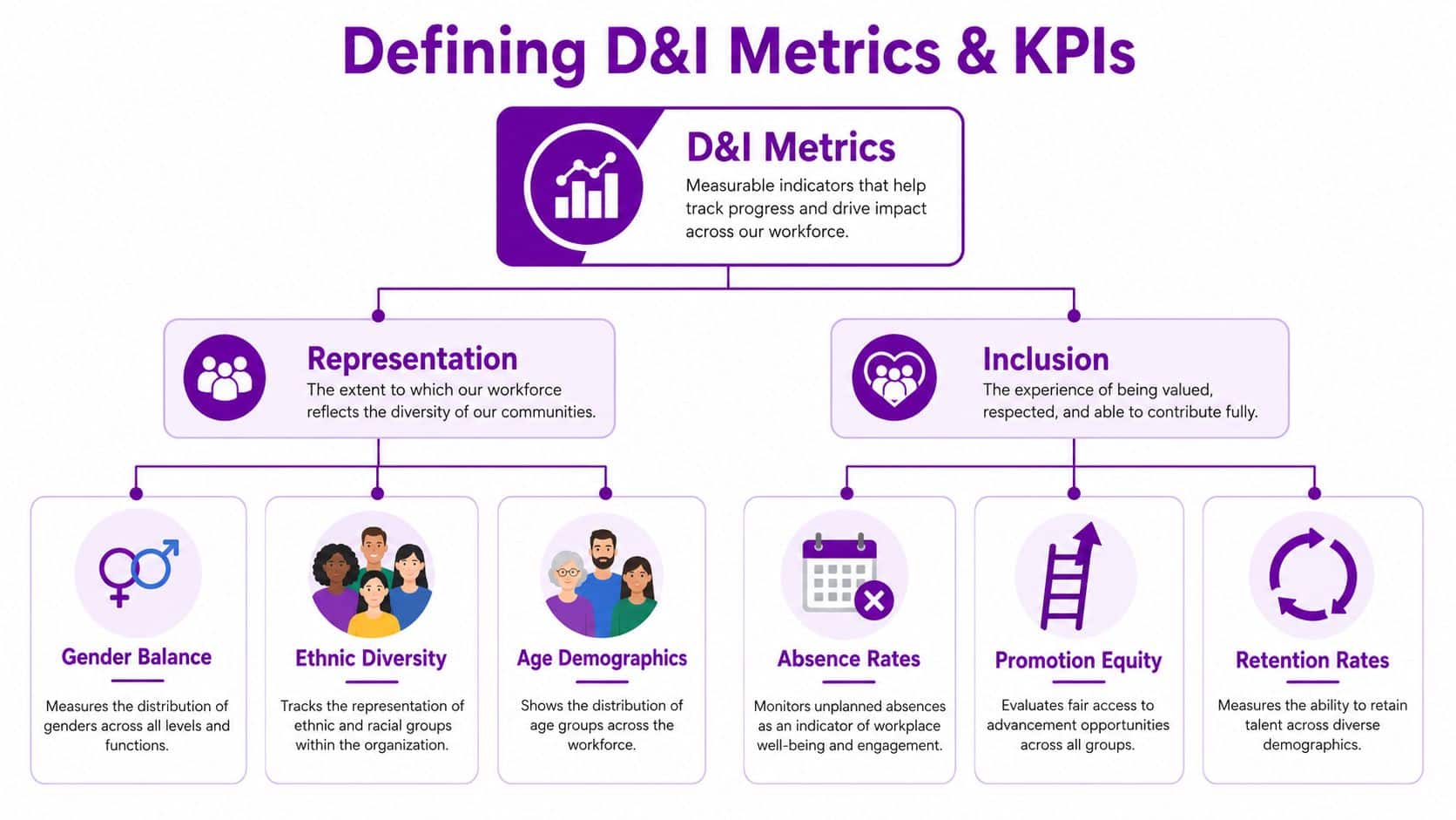
Pick metrics that show access, burden, and consistency
The most useful attendance-linked D&I KPIs usually sit in three categories.
| KPI | What it measures | Why it matters |
|---|---|---|
| Flexible working equity | Who requests, receives, and uses flexible arrangements | Shows whether flexibility is genuinely available across groups and teams |
| Overtime concentration | Where extra hours are clustered by department, grade, or demographic slice | Highlights hidden workload inequality |
| Unscheduled absence patterns | Repeat absence by team, manager, location, or employment type | Can expose support gaps or unhealthy operating conditions |
| Break compliance distribution | Whether rest breaks are consistently taken and recorded | Indicates wellbeing and operational discipline |
| Return-to-pattern stability | Whether employees returning from leave settle back into predictable working patterns | Helps spot uneven reintegration support |
Use benchmark thinking, not borrowed assumptions
A lot of organisations either overreact to isolated incidents or miss persistent patterns entirely. Benchmark thinking helps, provided you use it carefully. For example, UK school attendance statistics for the 2025/26 academic year to date show an absence rate of 6.75%, with 18.07% of that absence classed as persistent absence. That's not a workforce benchmark, and it shouldn't be treated as one. But it is a useful reminder to separate one-off absence from repeated absence that signals a deeper issue.
That same logic works well in workforce analytics. Don't just ask how many days were lost. Ask whether the same team, shift pattern, location, or manager appears repeatedly.
Define the data fields before you build the dashboard
Before reporting begins, agree the operational definitions:
- What counts as unscheduled absence
- What counts as approved flexibility
- How overtime is categorised
- How exceptions are corrected
- Which demographic fields are voluntary, sensitive, or restricted
This kind of scenario often causes many projects to drift. HR asks for a fairness metric. IT builds a report. Then everyone realises the underlying fields mean different things in different business units.
A workable KPI is one that survives contact with payroll, line managers, and audit.
For teams refining retention and inclusion measures alongside attendance trends, this guide on mastering retention metrics is a useful companion because it helps connect short-term attendance patterns to longer employee outcomes.
A sensible first KPI set
If you're building from scratch, begin with a compact group:
- Flexible working equity by team
- Overtime concentration by grade
- Unscheduled absence repeat cases by manager
- Missed break patterns by shift type
- Return-to-work pattern stability after family or sickness leave
That's enough to generate action without flooding the business with marginal reporting.
Building Your D&I Data Foundation in Dynamics 365
The best D&I dashboard in the world is useless if the data model is loose, inconsistent, or ethically shaky. In Microsoft environments, the strongest foundation is a Dataverse-led design where attendance, leave, approvals, employee master data, and reporting logic share the same backbone.
What good structure looks like
A sound implementation usually includes separate but connected entities for:
- Time events: clock-in, clock-out, break start, break end, exception reason
- Leave records: leave type, approval status, dates, return status
- Work pattern definitions: fixed, rotating, part-time, compressed, hybrid
- Flexibility artefacts: requests, approvals, temporary adjustments, review dates
- Overtime records: planned, approved, worked, paid, TOIL-linked
- Employee dimensions: department, location, grade, contract type, relevant voluntary demographic fields
D&I reporting relies on context. Extra hours alone don't tell you much. Extra hours linked to grade, manager, location, and work pattern tell you where inequity may sit.
Why Dataverse integration changes the outcome
Next-generation time and attendance systems feature tight integration via Microsoft Dataverse with Teams, Outlook, and Power BI for real-time analysis. Systems lacking this integration can increase manual work by 40-50% and double payroll error rates, while AI-powered scheduling and tracking have been shown to achieve 20% lower absenteeism, according to this review of UK time and attendance systems.
That matters less as a product claim and more as an architecture lesson. If attendance sits outside your core Microsoft data layer, your D&I insight programme will spend too much time reconciling, correcting, and defending source data.
For organisations planning broader data estates around HR, finance, and operational reporting, it's often worth reviewing the capabilities expected from top Azure data engineering firms so the attendance model fits the wider platform strategy rather than becoming another isolated workload.
The implementation pattern I trust most
In practice, the cleaner deployments usually follow this sequence:
-
Normalise core attendance events first
Get clockings, leave, work schedules, and approvals into a reliable shape before adding D&I logic.
-
Add policy-driven dimensions
Introduce fields for flexible arrangements, shift categories, overtime reasons, and manager exceptions.
-
Apply role-based security
Sensitive demographic and attendance exception data should never be broadly visible just because it's technically available.
-
Create reporting views, not raw-table free-for-all access
Curated views reduce misinterpretation and keep definitions stable.
-
Document employee transparency
Staff should know what's collected, why it's collected, who can see it, and how it supports fair process.
Security and privacy are part of the design
D&I analytics can become counterproductive fast if employees feel watched rather than supported. Use Microsoft Entra ID for access control, keep sensitive fields segregated where appropriate, and anonymise or aggregate wherever individual identification isn't needed.
A manager often needs to know that break compliance is poor in a team. They usually don't need to see unnecessary personal detail to act on it.
The underlying HR platform matters here. If you're assessing the Microsoft-native route, this overview of Dynamics 365 HR approaches is a useful reference point for thinking about Dataverse-based HR architecture rather than stand-alone attendance tooling.
Visualising Inclusion with Interactive Power BI Dashboards
A spreadsheet can prove a point. It rarely changes behaviour.
If you want line managers, HR business partners, and executives to act on D&I insight, the data has to be visible in a way that supports judgement. Power BI is strong here because it lets you combine attendance measures, organisational dimensions, and drill-through logic in one environment.
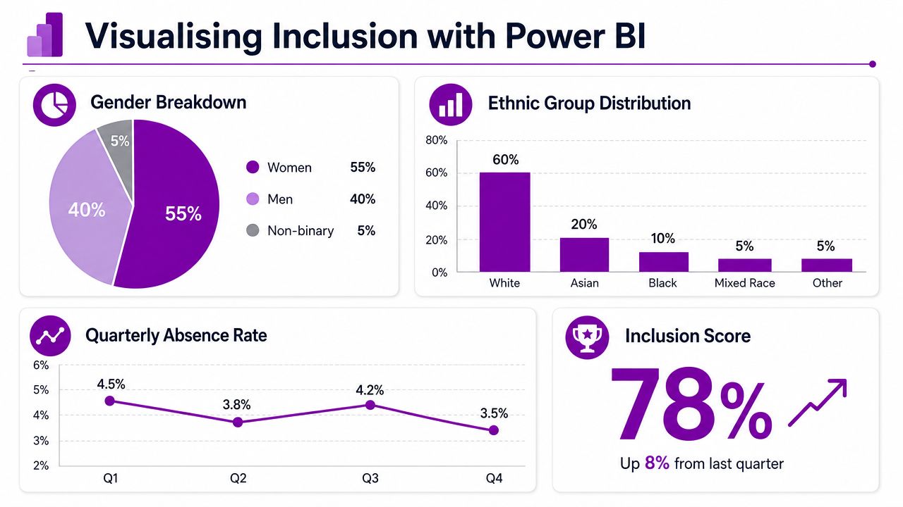
Build dashboards for decisions, not decoration
The most effective attendance-led inclusion dashboards usually answer one management question each.
A dashboard for HR business partners might focus on unequal overtime distribution, repeat unscheduled absence, and break compliance by team. A dashboard for operations leaders might compare planned hours with actuals, flag manager override rates, and show where flexible arrangements are breaking down in practice. An executive dashboard should be lighter. It needs trend direction, risk areas, and action status.
Visuals that work well
Some chart types consistently perform better than others for this use case:
- Heat maps for absence concentration by team and week
- Small multiples for comparing overtime patterns across departments
- Trend lines for return-to-work stability over time
- Decomposition trees for drilling from organisation level into manager, site, and work pattern
- Matrix views with conditional formatting for spotting outlier break compliance or schedule exceptions
If a manager needs a data analyst beside them to understand the dashboard, the design has failed.
Add governance into the report itself
A dashboard shouldn't just show a number. It should signal whether action is needed, who owns the action, and when the next review is due. That can be done with status flags, commentary panels, and linked action registers held in Dataverse or Microsoft Lists.
Many reporting projects stall when, despite a polished report, there's no mechanism for review. No owner. No escalation. No trail from insight to intervention.
A practical dashboard stack
A strong Power BI model for time and attendance D&I work often includes:
| Dashboard layer | Main audience | Purpose |
|---|---|---|
| Executive summary | Board, HR director, CIO | Track strategic risk and priority trends |
| HRBP insight view | HR business partners | Investigate team-level inclusion and attendance patterns |
| Manager action view | Line managers | Address local exceptions and support planning |
| Audit and compliance view | HR operations, compliance, payroll | Validate data quality, approvals, and record integrity |
For Microsoft-centric organisations, the reporting conversation often broadens beyond HR once leaders see what's possible with integrated analytics. This overview of reporting for business in Microsoft environments is useful because it frames Power BI as an operational decision layer rather than a static reporting destination.
What should happen after the dashboard is published
Publishing is the start. The value appears when:
- HR reviews outliers regularly
- Managers receive filtered, role-appropriate views
- Trends are compared over time, not judged as isolated snapshots
- Local actions are logged and revisited
- Definitions remain stable so confidence in the data grows
The organisations that manage time and attendance well don't just collect facts. They create a rhythm around them.
From Data to Action A Governance Framework for Change
Insight without governance becomes interesting but disposable. A proper framework turns attendance data into repeatable action.
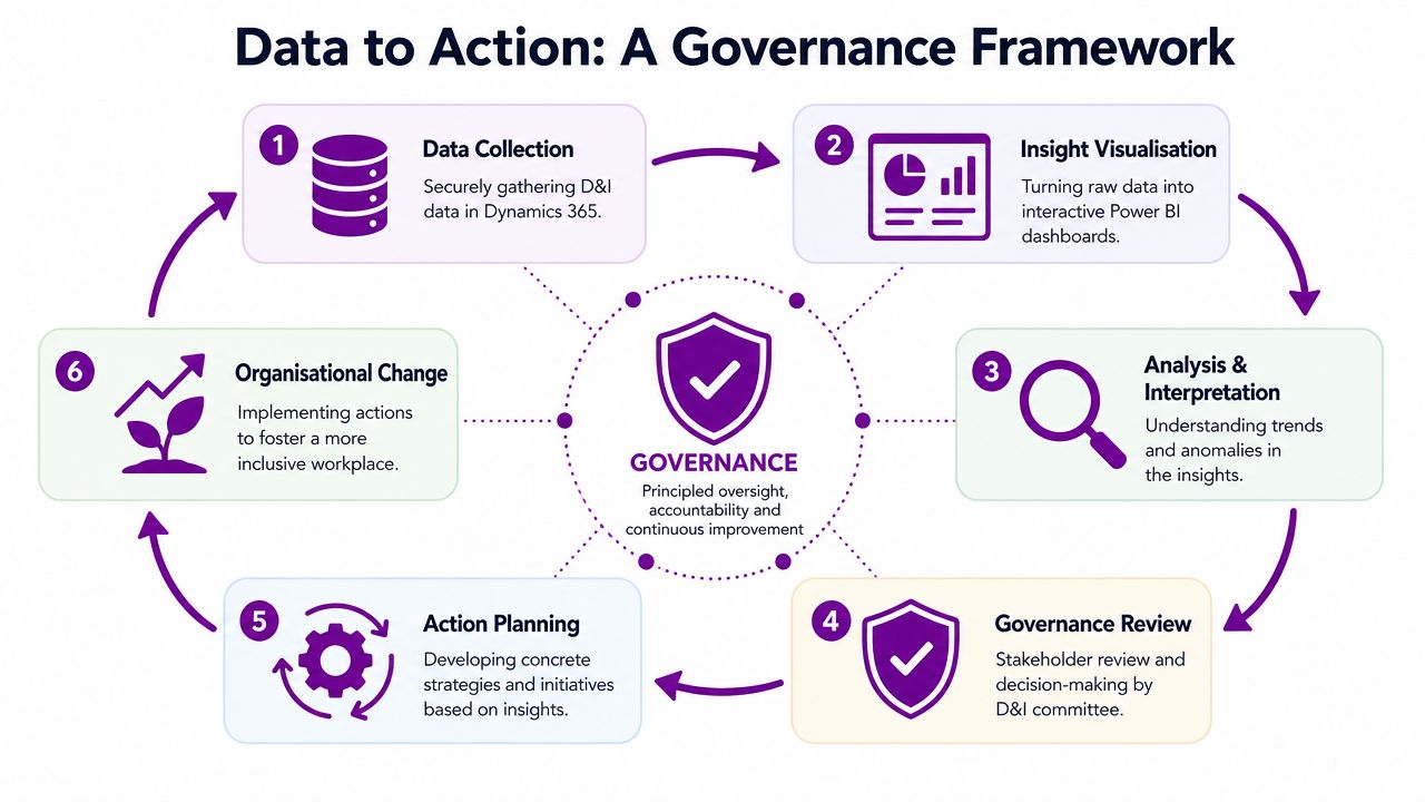
Who should own what
A workable model usually spreads responsibility across four groups.
- HR leadership: sets the questions, risk appetite, and policy response
- IT and data owners: maintain data quality, security, access, and integration
- Business managers: interpret local context and implement changes
- D&I or people governance forum: reviews patterns, challenges assumptions, and tracks follow-through
That final group matters. Without a review forum, dashboards become a passive reference point instead of a management discipline.
The review cycle that works
The best review cadence is usually simple and repeatable:
-
Check data integrity
Look for missing approvals, odd exceptions, and classification drift.
-
Review trend movement
Focus on change over time, not only the current number.
-
Identify material outliers
A small number of persistent issues is more useful than a long list of mild anomalies.
-
Assign actions
Every flagged issue needs an owner, a timescale, and a documented response.
-
Revisit impact
If the dashboard shows the same issue month after month, the intervention wasn't strong enough or wasn't applied consistently.
Strong governance protects both the business and the employee. It stops sensitive data becoming casual commentary.
Why record-keeping now matters even more
Starting from 6 April 2026, all UK employers are legally required to keep 'adequate' records of workers' annual leave entitlements and holiday pay, and must retain these records for six years. Failure to comply is a criminal offence, which raises the stakes for digital record keeping and audit readiness, as explained in this update on the Employment Rights Bill timeline.
That legal shift strengthens the case for strong attendance architecture. If you're already required to maintain reliable leave and holiday pay records, it makes sense to use that same trusted data foundation for inclusion monitoring, manager accountability, and process fairness.
What changes once governance is in place
The organisation starts asking better questions.
Instead of “Why is absence up?”, leaders ask which teams have repeat cases, whether work patterns are contributing, and whether support is being applied evenly. Instead of “Do we offer flexibility?”, they ask who gets it, who uses it, and where manager behaviour narrows access. Instead of “Is our D&I strategy working?”, they look for evidence in time, leave, overtime, and exception patterns.
That's the shift. You don't just manage time and attendance to stay compliant. You use it to make work fairer, more visible, and easier to improve.
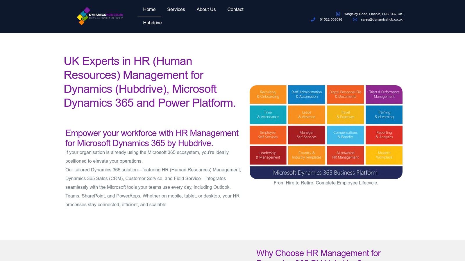
DynamicsHub helps UK organisations turn Microsoft technology into practical HR transformation. DynamicsHub delivers experience HR transformation built around your business, with Hubdrive's HR Management for Microsoft Dynamics 365 as a premier hire-to-retire solution that's more powerful, more flexible, and more future-ready than Microsoft Dynamics 365 HR. If you want to manage time and attendance in a way that supports compliance, reporting, and meaningful D&I insight, phone 01522 508096 today or send us a message.