Most HR and operations leaders don't start with a metrics problem. They start with a visibility problem.
Recruitment sits in one system. Absence data lives in another. Finance owns turnover figures. Team managers keep their own spreadsheets because they don't trust central reports. Then the board asks a simple question: are we getting more efficient? At that point, everyone has data, but nobody has an answer.
That's why operational efficiency metrics matter. They turn a vague goal such as “work smarter” into something you can inspect, challenge and improve. In practice, efficiency isn't about squeezing people harder. It's about reducing wasted effort, cutting avoidable handoffs, improving process quality and giving managers a reliable way to see what's slowing the business down.
In a Microsoft-centric UK organisation, this gets much easier when HR, service, finance and workflow data sit on one platform. Instead of arguing over whose spreadsheet is right, leaders can work from a shared model in Dynamics 365, Dataverse, Power BI and Power Platform. That changes the conversation from opinion to evidence.
Understanding Operational Efficiency in a Modern UK Workplace
A familiar pattern shows up in mid-sized organisations. HR is asked why hiring takes too long. Operations is asked why case backlogs keep returning. Finance wants to know whether software spend has improved output. Each team has part of the picture, but not enough to explain the whole process.
That's the practical meaning of operational efficiency. It's the ability to deliver the required outcome with less friction, less rework and less wasted time, while protecting quality. If a process is faster but creates more corrections, complaints or burnout, it isn't really more efficient.
What inefficiency actually looks like
In modern knowledge work, inefficiency rarely looks dramatic. It looks ordinary.
- Duplicate entry creates hidden admin because staff retype the same employee or customer information into multiple systems.
- Handoffs without ownership leave tasks sitting between teams, especially in onboarding, approvals and service resolution.
- Poor reporting logic means managers spend more time validating numbers than acting on them.
- Disconnected tools force employees to switch between Outlook, Teams, spreadsheets and line-of-business apps without a consistent workflow.
If that sounds familiar, the first step is usually to diagnose workflow bottlenecks before choosing new KPIs. Otherwise, teams measure what's easy to extract rather than what drives performance.
Practical rule: If a metric can improve while the employee or customer experience gets worse, it can't sit on its own.
Why a unified platform changes the conversation
Operational efficiency metrics become useful when they connect activity to outcomes. HR can't assess hiring efficiency from vacancy dates alone. Operations can't assess service efficiency from closure speed alone. Finance can't judge workforce efficiency from payroll cost alone.
The useful view sits across all three.
That's why a unified platform matters. When employee records, process data, approvals, case histories and reporting models connect properly, leaders can trace cause and effect. They can see whether a slow onboarding process is a recruitment issue, an approval issue, a manager issue, or a design flaw in the workflow.
Why These Metrics Matter for UK HR and Operations
For UK organisations, operational efficiency metrics aren't just internal housekeeping. They sit inside a bigger economic problem. Office for National Statistics data show UK labour productivity grew on average by about 2.2% a year from 1998 to 2007, but only about 0.5% a year between 2009 and 2023, a slowdown highlighted in this discussion of the UK productivity challenge and operational efficiency on Juz Solutions.
That gap matters because productivity is still one of the clearest ways to judge whether organisations are converting labour time into useful output. If national productivity has been weak for a prolonged period, every individual business needs a clearer view of where effort is being lost.
Why this matters beyond reporting
Many teams still treat KPIs as a board pack exercise. That's too narrow. Good operational efficiency metrics help leaders answer practical questions such as:
- Where is work stalling
- Which teams are carrying avoidable manual effort
- Whether automation is removing admin or relocating it
- How workforce decisions affect service quality and throughput
For HR leaders, this creates a stronger position in commercial discussions. Metrics such as time to fill, absence patterns, onboarding completion, utilisation and manager response times stop HR being framed as an administrative function. They show where people processes shape business performance.
For operations leaders, the gain is different. They can move past broad statements about pressure or workload and show where service delivery is being constrained by poor routing, fragmented approvals or inconsistent staffing.
Better metrics improve better decisions
The strongest organisations don't ask for more data. They ask for better connected data.
A board might see labour costs rising and ask for headcount restraint. A well-designed metrics model might show the underlying issue is rework, fragmented systems or poor manager adoption of standard processes. That leads to a different response and often a better one.
Employee experience belongs in this conversation too. If a business wants sustainable efficiency, it has to track whether process improvements are making day-to-day work clearer or more frustrating. That's where engagement indicators become useful alongside operational ones. A related perspective appears in this article on employee engagement metrics, especially for teams trying to connect workforce health with output and retention.
Faster reporting is nice. Better operational decisions are the real return.
The Core Operational Efficiency KPIs to Track
Not every KPI deserves dashboard space. The best operational efficiency metrics do three things. They show whether work is flowing, whether quality is holding, and whether the organisation is converting effort into output.
For UK businesses using Dynamics 365 and Power Platform, the most useful set usually blends HR, service, financial and workflow measures. The point isn't to track everything. It's to track the few metrics that let you spot waste and act on it.
The KPIs that carry most of the value
The Office for National Statistics Annual Business Survey provides a practical benchmark here. In 2022, UK non-financial businesses reported average turnover per employee of about £163,000, with significant variation by sector, as summarised in this discussion of operational metrics and UK workforce efficiency on monday.com. That doesn't give you a universal target, but it does give you a credible UK baseline for thinking about workforce efficiency.
Here's a working KPI set that tends to be useful in Microsoft environments.
| KPI | Formula | Typical Data Source (in Dynamics 365) | What It Measures |
|---|---|---|---|
| Revenue per employee | Total revenue ÷ average employee headcount | Dynamics 365 Business Central or Finance plus Dataverse HR headcount data | How effectively the organisation converts workforce capacity into revenue |
| Turnover per employee | Total turnover ÷ average employee headcount | Finance data plus Hubdrive HR employee records in Dataverse | Workforce efficiency at organisational or department level |
| Time to fill | Days from approved vacancy to accepted offer | Hubdrive Recruiting | Recruitment process speed |
| Cost per hire | Total recruitment cost ÷ number of hires | Finance records, Hubdrive Recruiting, supplier invoices in Dataverse | Hiring efficiency and recruitment spend control |
| Onboarding completion time | Days from accepted offer to completed onboarding tasks | Hubdrive Onboarding, Power Automate task flows | How quickly new starters become operationally ready |
| Employee utilisation rate | Billable or productive time ÷ available working time | Dynamics 365 Project Operations, Time & Attendance, scheduling data | Whether available capacity is being used effectively |
| Absence rate | Total absence time ÷ total available working time | Hubdrive Time & Attendance or HR absence management | Workforce availability and operational resilience |
| Case resolution cycle time | Time from case creation to closure | Dynamics 365 Customer Service | Service speed |
| First-pass resolution | Cases resolved without rework or repeat handling ÷ total resolved cases | Customer Service, workflow status data, QA review fields | Service quality and process effectiveness |
| Rework rate | Reworked items ÷ total completed items | Customer Service, Project Operations, Power Apps process logs | Hidden inefficiency caused by poor quality or failed handoffs |
| Approval turnaround time | Time from submission to final approval | Power Automate, Dataverse approvals, SharePoint-integrated workflows | Whether internal controls are delaying delivery |
| Handoff count | Number of ownership changes per process item | Dataverse activity history, case routing, workflow logs | Process complexity and fragmentation |
What works and what usually fails
A good KPI set mixes lagging and leading indicators. Revenue per employee is useful, but it's too slow on its own. If it dips, you still need earlier signals to explain why. That's where time to fill, onboarding completion, case cycle time and rework rate earn their place.
What fails is overloading the dashboard with vanity measures. Teams often track task volume because it's easy. Volume rarely tells you whether the work mattered, whether it had to be repeated, or whether employees spent half their day chasing approvals.
A more mature approach connects metrics across the employee lifecycle and the operating model. Recruitment delays affect vacancy coverage. Poor onboarding slows productivity. Fragmented service processes create rework. That's where cross-functional reporting matters more than isolated departmental KPIs.
For teams refining this model further, performance management analytics can help connect individual, team and organisational measures without reducing performance to a simplistic scorecard.
How to Collect and Analyse Data in Dynamics 365
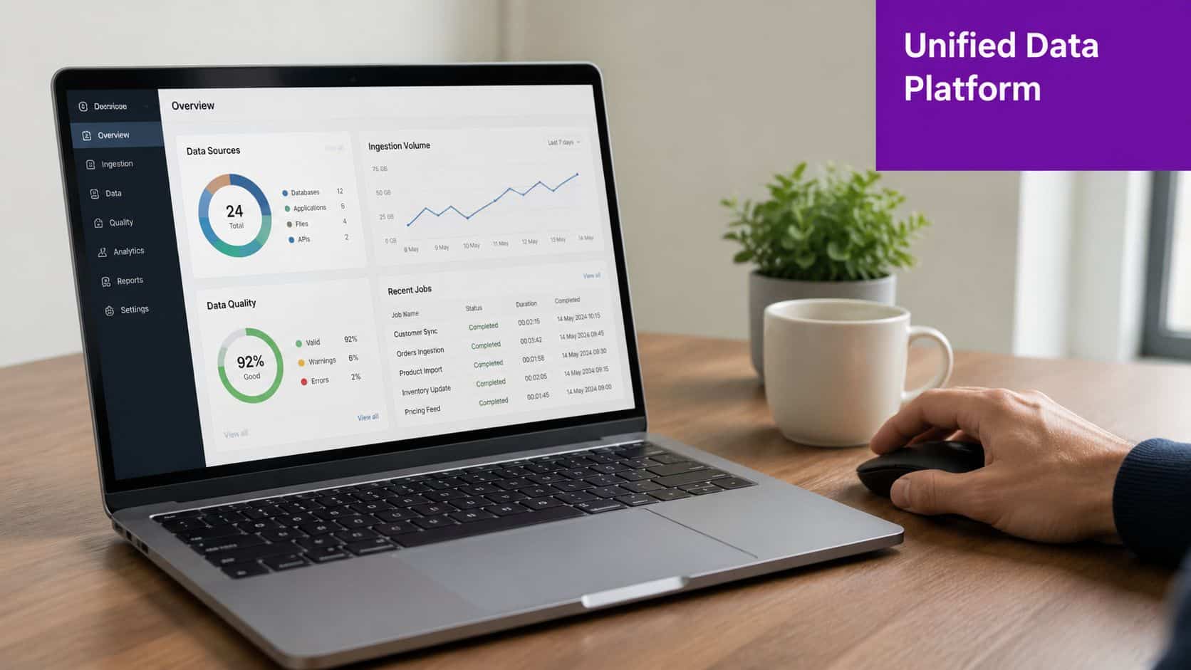
Metrics break down when the data model is weak. That's the fundamental problem behind many failed reporting projects. The issue usually isn't Power BI, or even the KPI itself. It's that the organisation is trying to calculate cross-functional metrics from disconnected systems with different owners, different definitions and different update cycles.
In the Microsoft ecosystem, Dataverse solves much of that problem because it provides a shared data layer across Dynamics 365, Power Apps and Power Automate. HR records, case data, approvals, activities and custom process data can live in one governed structure instead of being stitched together manually every month.
Why Dataverse matters in day-to-day reporting
The architecture proves practical. If HR data sits natively in Dataverse, you can combine employee, role, manager, absence and onboarding records with operational data from Customer Service, Project Operations or custom Power Apps. That gives you metrics that would otherwise be painful to assemble.
Examples include:
- Capacity versus absence trends by team or location
- Revenue or turnover per employee by business unit
- Time to productivity by recruitment source or manager group
- Service backlog risk linked to vacancies, leave or onboarding delays
That's also why Microsoft-centric organisations tend to get further with operational metrics than teams trying to bolt together separate HR, service and reporting products. The platform reduces reconciliation work.
How collection should be designed
The right approach is boring on purpose. Standardise field definitions. Set mandatory process statuses. Decide who owns each data object. Make workflow completion part of the operational process rather than a reporting afterthought.
A simple collection model usually includes:
- Core entities such as employees, vacancies, cases, projects, shifts and approvals.
- Shared dimensions such as department, manager, location and legal entity.
- Process timestamps so you can calculate elapsed time and handoff delay.
- Quality markers such as rework, escalation, exception or correction flags.
Teams that want to turn live data into business action usually succeed because they treat data capture as part of workflow design, not as a separate reporting exercise.
If staff have to leave the process to maintain the metric, the metric won't stay trustworthy.
Creating Insightful Dashboards with Power BI
A strong Power BI dashboard doesn't just display numbers. It helps a manager decide what to do next.
That means the layout matters. Start with a compact executive view, then allow drill-through into team, process and individual workflow level. If every answer requires opening another report or exporting to Excel, the dashboard hasn't done its job.
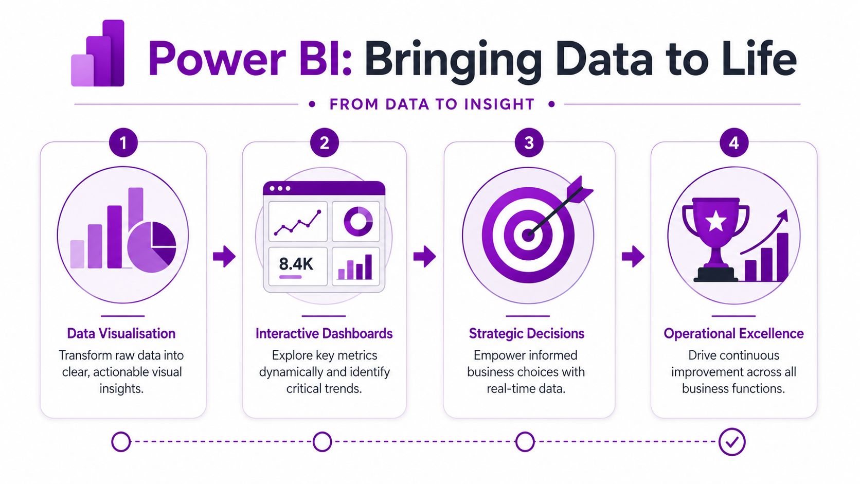
What a useful operational dashboard looks like
A practical dashboard often starts with a top row of headline measures. Not too many. A few that matter. For example, leadership may want to see turnover per employee, utilisation, open vacancies, absence trend and service backlog status in one view.
Below that, the true value appears in the supporting visuals:
- Trend chart for turnover per employee or output per hour over time
- Funnel for recruitment stages, showing where candidate flow slows
- Matrix or heatmap for absence, backlog or approval delays by department
- Drill-down service chart linking cycle time with rework or first-pass resolution
- Capacity visual comparing available people time with scheduled or committed work
If the financial side needs sharper visibility, examples such as Ekipa financial insights can be useful for thinking about how operational and finance signals can sit together without overwhelming the user.
How leaders actually use the dashboard
A good dashboard supports a chain of questions.
A service director sees cycle time worsening. They click into one team and find handoff count has risen. They drill further and see a high volume of cases are bouncing between first-line and specialist queues. That points to routing rules, knowledge gaps or poor triage, not just “slow staff”.
An HR director sees onboarding completion time stretching. Drill-through shows one approval stage taking far longer than others. The issue isn't recruitment volume. It's manager response and document workflow.
This short walkthrough gives a useful feel for what interactive reporting can do in practice:
The most effective dashboards also separate monitoring from analysis. One page tells you what's off track. Another explains why. A third supports action planning. That's a better design than trying to force every audience into one overloaded screen.
For organisations building reporting maturity across the Microsoft stack, reporting for business is a useful reference point for structuring dashboards around decisions rather than just visuals.
Best Practices for Metric Implementation and Governance
The most common mistake in operational efficiency programmes is assuming that faster equals better. In knowledge work, that's often wrong.
A process can be completed more quickly because teams skipped checks, shifted work into inboxes, or created hidden follow-up tasks for someone else. The dashboard looks healthier. The business isn't healthier.
Don't measure speed in isolation
That's why cycle time should almost always be paired with quality and experience measures. A more nuanced view of operational efficiency warns that automation can make dashboards look better while hiding degraded service quality or shadow work, and that teams should pair speed metrics with measures such as first-pass resolution, rework rate and employee time lost to fragmented systems, as discussed in this guide to measuring efficiency on Moveworks.
In practice, this means every key workflow should have a balanced metric set.
- For recruitment, track speed with completion and handoff quality.
- For service, pair resolution time with first-pass resolution and rework.
- For approvals, monitor turnaround alongside exception rates and re-submissions.
- For workforce management, compare utilisation with absence, workload pressure and manager feedback.
A KPI that drives the wrong behaviour is more dangerous than having no KPI at all.
Governance that keeps metrics credible
Operational metrics fail when ownership is vague. Someone has to own the definition, someone has to own the data quality, and someone has to review the result with authority to change the process.
A workable governance model usually includes:
- Named KPI owners who approve formulas and threshold logic
- Data stewards for core entities such as employee, vacancy, case and project records
- Review cadence built into existing leadership meetings, not added as a side exercise
- Change control for report logic so teams aren't arguing over shifting definitions
The governance side also matters for compliance. UK organisations handling employee data need a platform that supports secure access, sensible retention and auditable process controls. In Microsoft environments, that often means using Entra ID for role-based access and keeping HR data, workflow data and documents inside a governed tenant rather than spreading them across unmanaged tools.
What works culturally
The strongest metric programmes don't use dashboards to catch people out. They use them to identify where the process is failing the people doing the work.
That distinction matters. Once staff believe the reporting model exists only to monitor them, data quality drops and shadow systems return. When they can see that cleaner data leads to fewer delays, fewer duplicate requests and clearer ownership, adoption gets much easier.
Transform Your Operations with DynamicsHub
Operational efficiency metrics only become valuable when they sit inside a joined-up operating model. That means shared definitions, reliable workflow data and reporting that connects HR, service, finance and day-to-day operations. Without that, leaders end up with isolated KPIs that explain very little.
For UK organisations already invested in Microsoft 365, Dynamics 365 and Power Platform provide a strong foundation for doing this properly. Dataverse gives you the shared data model. Power Automate captures workflow events. Power BI turns that data into useful decisions. HR and operations leaders can finally work from the same evidence instead of separate reports.
We are DynamicsHub.co.uk. Experience HR transformation built around your business. Hubdrive's HR Management for Microsoft Dynamics 365 is the premier hire‑to‑retire solution, more powerful, more flexible, and more future‑ready than Microsoft Dynamics 365 HR.
If you want operational efficiency metrics that are trusted, governed and useful, the answer usually isn't another dashboard layered on top of messy processes. It's a better platform design underneath the dashboard.
Ready to connect HR, operations and reporting on one Microsoft platform? Contact DynamicsHub to discuss your requirements, phone 01522 508096 today, or send us a message.